ChromAnomaly

Photographing (and cooking) food

My first foray in to photographing food was while my fiancee was baking. While she was distracted with the flour and eggs (I don’t bake for the record), I snuck a few photos. My first inclination was to try out my macro lens since I generally feel that amateur food pictures suffer from the depth of field being too large, and professional culinary photography always features close ups . . . turns out this was probably a mistake, as Linda’s muffins looked like creepy technicolor lunar landscapes in my photos. The looked quite normal (and tasted delicious) in real life.

Ok, so in an effort to redeem myself I cooked dinner the next day (I do cook, pretty well if I may say so myself) and tried a few photos with my standby 28mm-135mm lens. I did have to break a few rules of composition to avoid taking a picture of an unsightly range burner or stray bottle of vinegar in the background, but I think it came out pretty well. This shot was beautifully backlit by the range hood’s light (believe it or not, this seems to work quite well) with a bit of ambient light from the overheads in the kitchen behind me. White balance was a little painful, but I think it came out in the end – this is a really critical piece for culinary photography! A poor white balance can completely ruin the appearance of food.

Capellini Puttanesca

Capellini Puttanesca

Ok, and if you’re interested here’s the recipe. I love this stuff, and it’s really easy.

1 box Angel Hair Pasta
1 lbs Crawfish (tail meat), or substitute shrimp, crab, etc
2 cans Diced Tomatoes (get the kind with green chilies, and drain most of the liquid)
1 bulb Garlic
1 cup Fresh Basil
2 tbsp Olive Oil
1 tsp Oregano
Salt and Pepper to taste
Garnish with Parsley and Grated Parmesan Cheese

Chop the garlic into rough slices (This will result in garlic that maintains a bit of it’s raw flavor. If you don’t like that, mince it instead). Shred the Basil and set aside.

Boil water per directions on pasta box, salt to taste.

While the water is heating, add olive oil to a large pan and warm over medium heat. When the oil thins and begins to flow, add the garlic. Saute 2 min, then add oregano, salt, and pepper to taste. Continue to saute until garlic begins to brown around edges.

Turn heat to high and add tomatoes, stirring until mixture begins to bubble. Turn heat back to medium and add basil. Mix in basil and let cook 2 min. Cover and turn heat the medium-low.

Add pasta to boiling water. Cook to short end of package directions, or about 6 min. Drain pasta.

Add pasta and crawfish to sauce pan, mix thoroughly. Cover and cook 5 min.

Serve immediately, garnish with parsley and grated Parmesan cheese.

Magic Quotes

So apparently I had magic quotes in my blog. I suppose that’s a good explanation for why they were reproducing like rabbits in the spring :P Apparently magic quotes are an obnoxious little feature of older versions of PHP (and WP, which is what I use for my blog, is PHP based) where quotes and apostrophes in submitted text are marked by the code with the addition of either a backslash or an additional quotation mark by default. The feature can be turned off, however, for the somewhat obvious reason that it can make a mess of the submitted text. This results in a rather severe complication – if a system is expecting magic quotes to be off, but they are turned on (which they are by default), then quotation marks start to replicate.

In the case of WordPress, everytime I saved a draft of a post, the quotes would replicate. So if I saved one draft, then posted the text I would have quadrouple quotes. Magic quotes indeed!

Thankfully I have now drained my quotes of all their magic, leaving them mundane husks of their former selves and saving the magic for my photos ;) Unfortunately, I don’t feel like going back and un-doing all the magical quotation reproduction that happened on earlier posts . . . so I’ve cleaned up the worst of it, but you may still run into some stray crazy quotes. Don’t worry though, they are harmless in their current state.

Engagement Photos

diamond engagement ring

diamond engagement ring

I’ve been gone for awhile thanks to having one heck of a busy summer. I’m sure you can guess from the photo to the left, or perhaps from the post title . . . but one of the things keeping me busy was getting engaged :) And considering that I was single at the beginning of the summer, a lot has happened in the past few months! (a lot of good stuff I might add)

Don’t worry, there are plenty of photography relevant stories from the summer. But you’ll have to forgive me if I’m still feeling rather proud of the fact that there is now a beautiful young chemical engineer who wants to spend the rest of her life with me :) Ok, before I make anyone sick . . . yes, I took the photo of Linda’s ring to the left. And I learned a lot of valuable lessons while trying to pull it off.

I captured that photo on my trusty Canon 40D with my 100mm macro lens.  The ring is sitting in it’s black leather box, which lead to lesson number 1: when photographing a ring, pull it as far out of the box as you can while still keeping it upright. I took a bunch of photos with the ring about halfway down in the little slot that holds it, and they generally look like crap. Count on losing about 50% of the circumference of the ring that’s still showing because it will be in shadow . . . which means I got a lot of silly photos of 1/4 of the engagement ring. The ring box does make a really nice backdrop since it’s dark, provides both a base and a backdrop, and casts a shadow that lets the band gradually fade out of view . . . just be careful that the nice shadow doesn’t swallow your ring.

For lighting, I used a bare bulb off to the camera left. I knew I was working with my macro lens which limits light intake, so I went with a really hefty bulb quite close to the ring – funny when you think about it, the light source was several times larger than the ring, even from the camera’s perspective. You have to be careful with lighting like this, as it’s quite easy to end up with significant lens flare. Canon lenses are generally exceptional at reducing lens flare thanks to little diffraction grooves that line the inside of the barrel . . . but even the best lens can succumb in situations like this. Make sure everything around your scene is draped in black to minimize stray reflections.

Speaking of stray reflections, we’re photographing metal and diamonds. I assumed that a lighting setup similar to the way you would light metal and glass would work pretty well. Namely, you want to minimize reflections everywhere except the very edge of the subject, which means positioning your light so that only the edge of the subject is lit in such a way that edge reflections are directed into the camera (using the rule that the incoming angle of light is equal to the reflected angle of light). This all worked fine in theory, but as you can see from the photo, diamonds are much more complex than most pieces of glass. And their legendary propensity for reflecting light wreaks havoc on a photographic setup. Due to the numerous facets as well as the incredible refractivity of diamond, there is almost no way to completely control reflected light. Of course, if I did a perfect job of it, the diamonds probably would have looked like glass . . . which I suppose defeats the purpose. Anyway, I think the little rainbows in the photo work quite well . . . though I’m still upset that I couldn’t do a better job of creating distinct edges.

engagement photo

engagement photo

Ok, last lesson I learned and a fun photo. I tried capturing some HDR series with my macro lens. This did not work out so well. In spite of using a good tripod and a remote trigger, I just couldn’t keep the focus coherent between multiple exposures. I’m not entirely sure why this happened, especially since I had the lens set to manual focus. But something about the extreme differences in visible objects in the scene as the exposure changed made it impossible to line up the frames and get a decent image. Basically the dynamic range in the scene was too big even for a high dynamic range image. I guess that makes a significant statement about the brilliance of Linda’s diamond ;)

I think maybe if I had stepped the HDR in smaller increments and taken more exposures I could have gotten something to work with. But then of course I would have risked shifting the camera as I adjusted settings in the menu. So I’m at a bit of a loss for a practical solution. I mean literally the dark exposure developed all the texture of the leather box, but there was no ring in the photo; the middle exposure developed the shape of the ring, but there was no box; and the light exposure developed a beautiful reflected rainbow from the diamonds, but you couldn’t even make out the edges of the ring.

Perhaps this is why I’m always disappointed by the photos of diamonds in catalogs though :P And perhaps why I never thought I liked diamonds. I have to admit though, I really like the look of a diamond on Linda’s finger . . . I may have to buy her more. You know, to practice my photography skills ;)

Giant Insect Photos

butterfly and the bee
I”m catching on ;) I finally got my head wrapped around what I need to do to take good macro photos. As I’ve mentioned before, because macro photography generally involves getting the camera lens right up close to a really small subject, there isn’t much available light to reflect back into the camera. This results in the aperture of the lens opening up really far, and likely a slow shutter speed as well . . . so your depth of field becomes ridiculously shallow (a few millimeters), and a tiny little bit of camera shake can kill your photo.

flying bumblebeeFocusing becomes critical – this is no time to rely on your camera’s autofocus. My Canon 40D generally has a great autofocus, and the ultrasonic motor in my 100mm macro lens is smooth and fast . . . but it’s still no match for a flying bumblebee. The key is to focus fast and then snap a couple shots as you incrementally adjust the focus ring. With a focal plane of a couple millimeters, it’s nearly impossible to tell through the viewfinder whether you are focused on the bee”s head or just a stray hair on its back that is pointed towards the camera. And the autofocus obviously has the same problem. In addition to the fact that when you try to focus on an object that is moving in and out of the focal plane, the autofocus will never manage to get a good lock – it will scan the macro focus range, not find anything, then focus way out in standard mode at which point it probably picks up a tree or something in the background. There goes your beautiful bumblebee photo, because by the time you get your bearings and crank the focus ring back down to macro range it’s gone.

I”ve saved the best for last though . . . I had been frustrated with my inability to create depth in my photos with my macro lens since everything that needs to be in focus has to be in the same plane. Turns out you can trick the eye substantially by rotating the camera. Keep the plane of the lens perpendicular to the subject, but just rotate the camera so that your object spans diagonally across the image. It means thinking a little differently about composition, but it works.
dragonfly wings

Your other option for creating depth of course is artificial lighting (so that you can use smaller apertures and increase your focal depth). Your flash is not likely to help because the barrel of the lens will cast a shadow on the subject at close proximity. That’s why camera companies make ringlights which mount to the end of the lens. Unfortunately, ringlights are expensive and have a serious drawback – they create perfectly flat lighting. Oh, and they are heavy and bulky, though they do have the advantage of interfacing perfectly with your hotshoe. Anyway. The solution here is to mount a couple LEDs on flexible “antennae” that you can switch on and off. Attach them to your camera, and you should have a perfectly flexible miniature studio for dynamic lighting of small things :) This is my next project, I’ll keep you updated on how it goes.

By the way, the above photos were taken at the Cincinnati Nature Center – a privately owned and amazingly well kept nature preserve that is open to the public. It’s beautiful and secluded, tucked away in Milford . . . I highly recommend it :)

And yes, I know that I’m getting double apostrophes in my posts and that some of my old images have disappeared . . . working on that – I switched servers recently (upgraded to a dedicated system! :) ) and it’s screwing with my WordPress installation. Anyway, hopefully just a temporary issue!

Let’s Talk Lighting

Lighting? What does that have to do with color or perception? Well lots of course, otherwise I wouldn’t be writing about it :P Light is how we see color in the first place – light bounces off objects and into our eye – and not all lights are made equal. Have you ever noticed the color of an object change when you walk out of a store and into daylight outside? The property of having different colors in different lights is called metamerism . . . but personally I think this is a rather flawed concept as ALL objects are metameric to some extent (in an extreme case, all objects are black when there is no light, or all objects are reddish when viewed in pure red light). Of greater interest than these extreme cases though are the cases we encounter every day.

Most photographers know that outdoor photos have the most “natural” color rendering, while photos under incandescent lights (ie standard house lights) look yellow, and photos under fluorescent lights look greenish. Many photographers are forgetting this concept as cameras get better and better at auto white-balancing, but it’s an important thing to understand nonetheless. And of course, it’s the whole reason you have to (or should) white balance your photos. The reason photos look different under different lights is because the light sources have different spectra. Light is made up of waves of different wavelengths, and these wavelengths are perceived by your eye to be different colors. Back to the extreme case of a red light, all objects will look red because the light emits the red wavelength (around 700nm wavelength if you’re interested), and an object can only reflect or absorb red – its quite unlikely that the object will absorb red and emit a different color (it’s possible, but these are the exceptions to the rule).

You can probably start to see why it’s important to have a balanced light source – if your light doesn’t emit anything in the green wavelength range, then green objects have nothing to reflect and will look black. Your brain is really good at tricking your eyes though. So when we’re inside and the room is light by incandescent lighting we don’t stand around and wonder why everything looks so yellow – our brain figures out where the light is coming from, takes stock of the color of the light source, and uses that information to filter the colors of every other object we look at. A camera, however, doesn’t have that luxury (though it certainly tries hard with the auto whitebalance) . . . and we don’t have that luxury when we look at a photograph. The photo looks yellow because the scene WAS yellow, and our brain tricked us into believing that it wasn’t.

So what’s the big deal if our brain tricks us? Let’s take a look at some spectra of light sources. Here is a typical incandescent bulb plotted as relative intensity of light at the various wavelengths (mapped as colors here so it”s easy to look at):
incandescent bulb spectrum
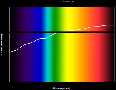
Not the black line running across the graph – that’s what a perfectly balanced spectrum would look like. So you can see the incandescent spectrum is severely lacking in the blue range, about right in the greens, a little high in the yellow, and fairly high in the reds. Your eye perceives blue and yellow to be opposites, and green and red to be opposites (more on that some other time, for now take my word on it). So the fact that incandescent lamps (and by the way, this includes quartz halogens as well!) have too little blue AND too much yellow compounds our perception of the scene being yellow. The bigger issue though is that blues and purples just plain don’t look right in incandescent lighting because they have very little incoming light to reflect (a huge problem for photography). And if your object has an optical brightener (which reflects in the UV by the way), it will look dingy under a tungsten bulb.

Ok, how about fluorescents? Fluorescents work differently than tungsten based bulbs – instead of heating up a metal which then emits energy from all of its electrons evenly, fluorescent bulbs stimulate a set of materials at specific energy levels which then fluoresce with a characteristic wavelength. There are lots of coatings and other modifications added to fluorescent bulbs, but here is what the spectrum typically looks like:
fluorescent bulb spectrum
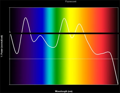
Woah! What’s going on there? Each of the peaks in this spectrum represents the characteristic fluorescent wavelength of one of the components of the bulb. And the valleys? These are spots where we don”t know of any economical materials that fluoresce at that wavelength. So it’s no wonder things look green under fluorescent light (note the large spike in the green wavelengths). But we can always white balance the photo to pull back the green. The more important issue is that there are many colors in the fluorescent spectrum that simply don”t exist (or exist at VERY low levels). So for example red objects and certain bluish-green objects will never look right in fluorescent light. And as before, the problem only gets worse in a photograph (remember, if the object didn’t have any light to reflect you won’t be able to recover or bump up that color in the photo – the color simply won’t exist!). The most devious part about the fluorescent spectrum is that it is often difficult to predict if a particular object will look ok or not – the missing wavelengths are very specific, so one bluish-green object might look fine, while one with a slightly different hue looks terrible!

Alright, so are there any solutions? Well, not really. At least not for photography. Stick with tungsten (incandescent) bulbs, and turn them up really bright (the advantage of using quartz halogen bulbs is that you can make them very bright) so that you at least get some blue light for the camera to pick up . . . and then white balance. Or shoot outside, that’s of course the best solution :)

For daily use in your house there actually is a great solution, but a word of warning – don’t use these lamps for photography! GE has come out with a new type of incandescent bulb called the Reveal, which does an amazing job of eliminating some of the characteristic yellow cast of tungsten lights. And while your brain is quite good at tricking your eyes, it’s very impressive the difference these bulbs can make in your house – eliminating dingy yellows and brightening blues colors.

So why not use the GE Reveal lights for photography? Let’s take a look at the spectrum for this bulb:
GE Reveal spectrum
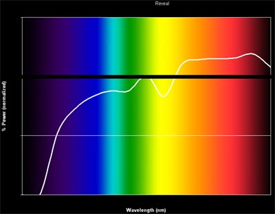
Ew, what happened there? GE added a material to the coating of this bulb which absorbs (primarily) yellow light. So there is less yellow in the resulting spectrum (and thus yellow objects look less yellow, and blue objects look more blue), but there is clearly not any more blue which as I mentioned earlier is the real problem with incandescent bulbs. In fact in a bit of a conundrum, it appears the GE Reveal might actually have LESS blue than a traditional incandescent! So it may work wonders on tricking your eye and brain, but it certainly won’t do any favors for your camera. In fact, because the spectrum is now non-uniform, you may actually have a more difficult time white balancing.

So there you have it. Buy GE Reveal light bulbs for your house. Don”t use them for photography :P

Colorblind Colors

Ok, I know it”s spring . . . but I want to write about fall colors. I”ve always felt rather gypped during the fall because I”m colorblind. People make such a big deal about fall colors, and I look at them and wonder what the big deal is. They look brown. And then people tell me it”s just because I haven”t been to New England, New England fall colors are so much better than Cincinnati fall colors. And I look at postcards of New England and don”t understand what the big deal is. They look orange-ish brown.

So for anyone out there who is wondering what fall foliage in New England looks like to a colorblind person, and to keep people from telling me I just haven”t seen the right fall colors to appreciate them, I took a backpacking trip in the Adirondacks last fall and took some photos. The first photo is what my camera captured, no adjustments. Beautiful I”m sure, but to me I can just tell that there are some red and orange trees, nothing special. In fact, I recall the scene looking more like the second photo. I actually had to stop and think “gee, there”s a tree with red leaves over there. I bet color-sighted people would think that”s pretty”. The third photo is my approximation of what the scene would have to look like in order for me to think “wow, that”s a bright red tree”. But even after the adjustments, I don”t think I”d call the color “amazing”. I”d like to assert that the third image represents the color adjustment required to make the world look to me like what the rest of you see naturally . . . but if I”m being honest I can only guess at what that looks like.

camera captured fall colorscolorblind fall foliagewhat fall SHOULD look like

So you can see why fall colors just don”t impress me much. And this probably explains why I really crank up the saturation on some of my photos . . . I”m just trying to make it look like I think it should. I suppose you”ll just have to believe me that my photos capture the way the world really looks. But even if you don”t believe me, that”s my prerogative and task as a photographer – to show you the world the way I see it.

Another Day, Another Broomball Tournament

Another day, another broomball tournament . . . or at least that’s how it seems lately! (I’m not complaining though, I like it :) ). Last weekend was the annual tournament in Des Moines, IA. By the way, I really cannot recommend traveling to Des Moines if you’re looking for a fun vacation. But they do host a great tournament every year.

I played on two teams for Cincinnati this year (a men’s team, and a co-rec team), and we brought three teams total. I figure that’s pretty impressive even if we didn’t fair terribly well in the tournament :P The range of skill levels was pretty crazy though – we mercy-ruled one team, then turned around and got mercy-ruled by another. It was a good time altogether, even if I couldn’t walk on Monday. And speaking of tournaments, the Cincinnati Broomball Association and Dayton Broomball Association are jointly sponsoring a tournament this summer! Keep an eye out for BroomFest ’09 – I think it’s going to shape up to be a pretty exciting tournament :)

I played too much broomball at the Des Moines tournament to take many photos, but I did get to shoot at a game and a half for the third team we brought. I was using my old Canon Rebel (which my friend inherited and brought with her) since it’s relatively compact. Actually, I felt like I was a giant trying to take pictures with a dwarf’s camera. I had gotten so used to my ridiculously oversized 40D that the Rebel was almost too small to hold. Funny how that happens. I still love the Rebel though, it’s a great starter camera. Can’t wait to see the photos, but I have to get my memory card back first :P

Learning to Use a Macro Lens

It takes practice. And patience. And lots of small things to photograph. But I think I”m finally catching on to using my new 100mm Macro Lens. I took it along with me on a backpacking trip to Shenandoah National Park last weekend, along with my 28mm-135mm Standard Zoom Lens that came with my Canon 40D. That added up to 2.5 pounds worth of lenses alone which I lugged up and down a couple mountains, but I definitely found myself switching back and forth a lot. Aside from the wide angle capability of the zoom (which I really needed sometimes because with the amount of fog we had, I couldn”t afford to back up very far away from my subjects), I hate trying to frame shots with a fixed focal length lens. That said, there were plenty of opportunities to take advantage of the macro, especially along the trail. By the end of the weekend I had decided to leave the macro on my camera unless we were cresting a mountain.

The macro lens does work as a standard 100mm lens quite well, with no additional considerations. Personally I find the 100mm focal length to be a bit awkward for framing, but that”s just me. The only real difference is in closeup shots – I could stick my face a foot away from my subject and still have the 100mm magnification power, but because there is very little incident light when you get this close to a subject the f/stop is usually at its minimum . . . resulting in a miniscule focal depth.

To illustrate, here”s a friendly little salamander I found on the trail. Both shots were taken with the macro, though you can clearly tell that the side view shot had little need for a deep focal plane. The head-on shot was not modified at all – the amount of blur you see is due strictly to the depth (or lack thereof) of the focal plane.

salamander side view
salamander front view

Both of the above images were taken in full daylight with no flash. Ok, well it was filtered daylight since it was foggy, but this was definitely not in the shade. I love the detail in this little guy”s face (though he wasn”t too sure about having my giant camera lens 6″ away from his nose), but I think the excessive amount of blurring along his body really damages this shot. Out of focus would have been fine, but that”s downright blurry. Oh well, live and learn.

Defending Broomball Champions Fall Flat

Back to Indianapolis last weekend for the second broomball tournament this year, and we brought a couple other local teams with us . . . but things did not go so well for our defending champion team. What can you do though, we’re a relatively new team, we don’t play together regularly, and a few of us were having really bad weeks. I did put in a nice goal and had a couple assists though, so at least I broke my dry spell. Hopefully we can clean up our act in time for the Des Moines tournament in a month . . . though of course the team will be a little different and the competition much tougher :P

I was pretty beat this week after the tournament on Saturday, then coming back to play a local broomball game with no subs on Sunday. A couple crisises at work with a major experimental operation kicking off in Germany this week didn’t help matters either.  And today was District Science fair at UC, which I judge every year. Not that judging a science fair is stressful, but it basically shoots a weekend day for me.  I can’t believe I’ve been judging science fairs for 13 years now, almost half of my life!

I know I owe you some photos with my new macro lens, but it’s got a bit more of a learning curve to it than I anticipated . . . nothing I’m happy with yet. But I’ve got a backpacking trip planned to Shennandoah in 2 weeks, so I should have some good stuff coming back from that :) Will be my first trip with the new camera as well (plus the extra lens, I hope I can carry all my gear :P )

Turning Down an Awesome Job

This past week kind of sucked. I was offered (ie I applied to and was asked to accept) a dream job . . . and I had to turn it down. The position was in Corporate R&D at P&G developing new methods for consumer research. They type of work that I had gone out of my way to get involved in just last year as a “pet project”, and someone offered to let me do it full time. Not to mention, I would have been working for someone that I have a ton of respect for and have enjoyed working with in the past.  And of course, the reason I applied for the job is because I was having a tough time finding those things in my current assignment.

Anyway, I turned down the position because I’m vying for a promotion right now (not that I’m necessarily very close to a promotion, but I’m actively working on getting one :P ), and I was told quite bluntly that there was no chance for promotion in the new assignment. One of those issues that sort of goes along with working in Corporate Functions. I was pretty upset about having to turn down the position, which of course made me second guess whether or not I was making the right choice . . . and I finally figured out why I was so upset. I sold out. I put my career and getting ahead in the company in front of doing important work, making a difference, and enjoying my job . . . something I never thought I’d do.

I’ve always dreaded the day that I would become a “Proctoid” – you know, one of those mindless office workers following orders and adapting to every whim of management just to get a little bigger piece of the pie. Procter and Gamble is notorious for its very efficient mass production of Proctoids (thus the name). My friends always told me I had it in me to become one, and I always laughed it off, certain that I was different. Well I might not be a Proctoid yet (I really hope not at least), but I certainly feel one significant step closer to the edge.

Bah. In spite of all that, I know I made the right decision. I can come up with all sorts of excuses for why it wasn’t really selling out, but at the end of the day it was just a crappy decision to have to make. I’m fairly certain that in the long run I’ll be more productive because I turned down the job. I just don’t feel very good about it right now.